New data has now become available that shockingly discredits the Mann “Hockey Stick” graphic used by Al Gore and others in the hysterical climate camp.

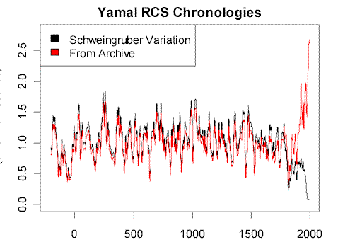
The next graphic compares the RCS chronologies from the two slightly different data sets: red – the RCS chronology calculated from the CRU archive (with the 12 picked cores); black – the RCS chronology calculated using the Schweingruber Yamal sample of living trees instead of the 12 picked trees used in the CRU archive. The difference is breathtaking.
The conclusion ?
This comparison to CRU archive data illustrates the most extreme example of scientific cherry-picking ever seen. As Steve writes in comments at CA:
Also keep in mind the implausibly small size of the current portion of the Yamal archive. It would be one thing if they had only sampled 10 trees and this is what they got. But they selected 10 trees out of a larger population. Because the selection yields such different results from a nearby population sample, there is a compelling prima facie argument that they’ve made biased picks. This is rebuttable. I would welcome hearing the argument on the other side. I’ve notified one dendro of the issue and requested him to assist in the interpretation of the new data (but am not very hopeful that he will speak up.)
See the complete report on this new development in the sordid story of tree ring proxies used for climate interpretation at Climate Audit. And while you are there, please give Steve a hit on the tip jar. With this revelation, he’s earned it.
What this means is that data from Russian tree rings has been cherry picked to yield a conclusion that the earth is warming and this is the hottest period in measurable records.
The volume at Climate Audit is so huge that the server is down. This is the global warming equivalent of a pimp and prostitute asking ACORN to help them set up an underage brothel.
UPDATE: More on this story,
While widely published in such prestigious publications as Science, Briffa has consistently refused to release the raw data on which his studies have been based. That alone should have been enough to disqualify him, as that is about as serious a breach of the scientific method as you can commit. But, perhaps because his studies undergirded the received wisdom regarding climate change, he got away with it. Until he published a paper in a publication of the Royal Society. The society has a policy:
As a condition of acceptance authors agree to honour any reasonable request by other researchers for materials, methods, or data necessary to verify the conclusion of the article… Supplementary data up to 10 Mb is placed on the Society’s website free of charge and is publicly accessible. Large datasets must be deposited in a recognised public domain database by the author prior to submission. The accession number should be provided for inclusion in the published article.
Steve McIntyre, a statistician and noted climate-change skeptic who has been repeatedly denied access to the data by Briffa for 10 years, wrote the Royal Society, which was embarrassed that this requirement had not been enforced. Briffa was eventually forced to comply (the details of McIntyre’s pursuit of the data he should have been given freely can be found in narrative form here). It appears (and I am no statistician, let alone a dendrochronologist) that the data was seriously cherry-picked to produce a desired result. When a larger and more logical data set is used, the hockey stick disappears (scroll down to see the chart). The late 20th century does not look any different from earlier times.
More yet here.
“1. I don’t believe this data plays into the “it’s worse than we thought” meme. This data is the basis of the hockey stick graphs that assert recent temperature changes are unnatural and AGW is blasting the graph above anything seen in human history.
2. The temperature history of the past thousand years or so is 2000 samples. The 12 trees are the basis of the late 20th century part of that history – the blade of the hockey stick.
3. Trees from the far north are used because their growth is assumed to be primarily limited by temperature. This should make them better treemometers than ones further south which have plentiful sunlight, a long growing season, and may be limited more severely by water availability, nutrients, or being blocked by neighboring trees. Still, they are only valid as treemometers if most of the population shows the same pattern. Once it is shown that the majority of the trees in that area don’t show the same 20th century pattern…
4. McIntyre has repeatedly focused on how the proxies represent current warming vis-a-vis the medieval warming period that some AGW ultraorthodox refuse to admit existed. He is not claiming that this work disproves AGW. I think he is claiming that with proper proxies the MWP can be seen to have been hotter than today.
5. Schweingruber is a colleague of Britta who took samples from the same type of tree in an area within the range of the Yamal samples. The addition of these samples gave a more robust result than the 12 samples Britta used.
6. Neither Britta nor Schweingruber archived samples they collected but decided not to use, but the assertion was made that one expedition would have collected far more samples than were kept. This leads some people to infer that cores were selected based on their conformity to the hockey stick theory.
This is really enough but it won’t be.
Tags: global warming